
For my second post in the series featuring automotive badges and lettering, I’m highlighting the industrial and streamlined look of the 1930s and 1940s. If you look at these examples as a whole, you can see the influences of both the mass production established in the ’20s and the corporate consolidation of the ’30s. The overall look of the badges had changed from representing craftsman’s signatures to standardized logos that emphasized the swift mechanical nature of the automobiles. Even the script lettering took on a more “machine made” look and an emphasis on power and speed. The messaging behind the use of script lettering continued to change in subsequent decades, but more on that in future posts.
If you’re interested in digging deeper into badge type design, check out writer and type expert Steven Coles’ excellent Tumblr page, Chromeography.
Interested in a print of one of my badge photos? Visit my store and place an order.
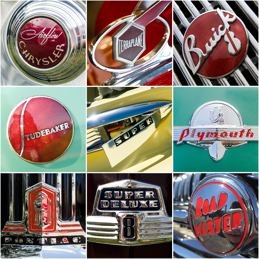
Top row, left to right: 1934 Chrysler Airflow, 1934 Hudson Terraplane, 1936 Buick. Middle row, left to right: 1937 Studebaker, 1941 Buick, 1941Plymouth. Bottom row, left to right: 1941 Pontiac, 1947 Ford, 1948 Buick.