Automotive Type, Part Seventeen

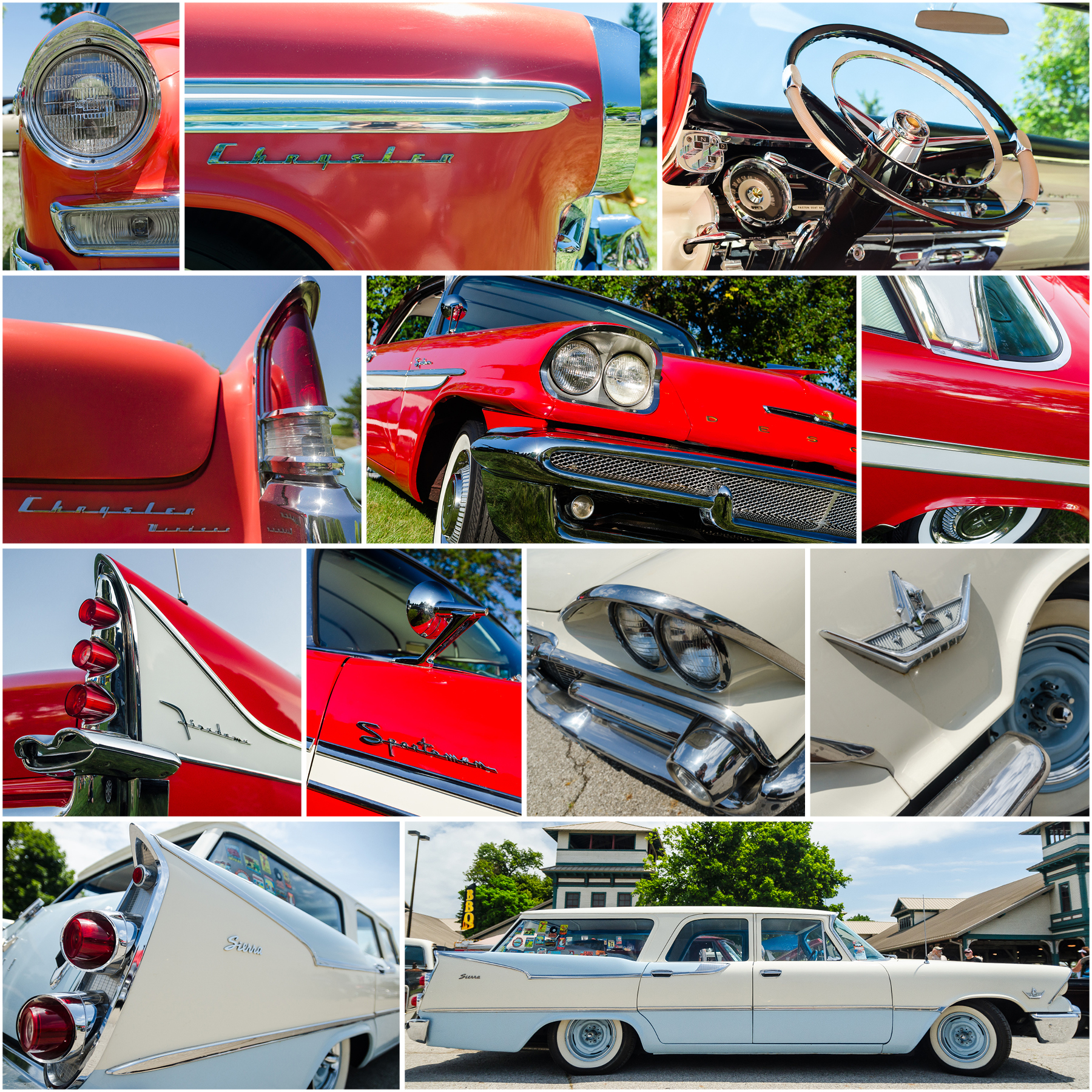
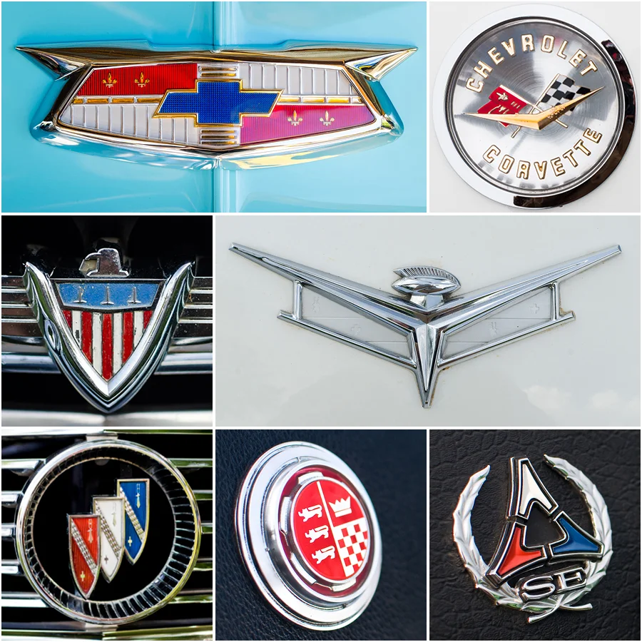
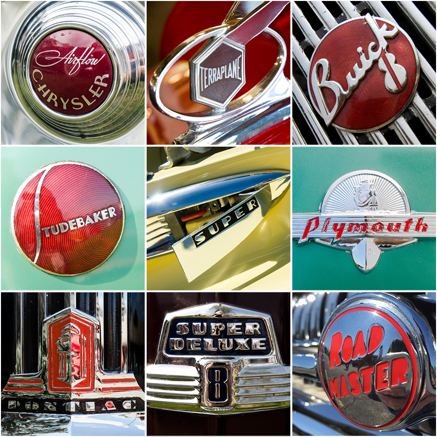
For the second blog post in a row, I'm lying. I'm not including type this week. I'm continuing with the theme of iconography, but this time I'm featuring far more sculptural examples. That's because these examples are freestanding hood ornaments.

Hood ornaments started out as decorative radiator cap toppers, such as Ford model A eagle below. Mostly, they appeared on luxury marques, but they were also popular as aftermarket add ons. As automotive styling became more streamline, the ornaments became more abstract, and by the end of the 1950s nearly all iconography had given way to freestanding logo ornaments. I'll feature more of those examples in a future post.

 All of the examples featured below are from the pre-war era and represent either human or animal figures. As you can see, most of the human figures are female, with the exception of the Hermes atop the marquette radiator. Most of the animal figures are birds. The exceptions being the gazelle atop the Chrysler, and the Greyhound atop the Lincoln.

If you’re interested in digging deeper into badge type design, check out writer and type expert Steven Coles’ excellent Tumblr page, Chromeography.

Interested in a print of one of my badge photos? Visit my store and place an order.

Top row, left to right: 1931 Chrysler, 1930 Marquette. Second row, left to right: 1937 Cadillac, 1935 Buick, 1930 Cadillac. Third Row, left to right: 1934 Packard, Ford Model A truck. Bottom Row, left to right: 1933 Buick, 1934 Packard, 1927 Lincoln.

Top row, left to right: 1931 Chrysler, 1930 Marquette. Second row, left to right: 1937 Cadillac, 1935 Buick, 1930 Cadillac. Third Row, left to right: 1934 Packard, Ford Model A truck. Bottom Row, left to right: 1933 Buick, 1934 Packard, 1927 Lincoln.

Automotive Type, Part Sixteen

Ok, so I lied in my title. This week’s post isn’t about type at all. It’s about icons. Specifically, it’s about animal icons. Some are iconic (sorry) like the Mustang’s galloping horse, while some are a bit obscure like the Buick Wildcat. 

A couple of my favorites are the Impala, with its brilliant abstracted line work and suggestion of speed, and the Barracuda. Yes, I’m a bit biased, but I’ve always liked the icon’s simple, sleek, sinister look with a tail that somehow feels a bit devilish to me. I also like the implied movement that suggests that it’s circling its prey.

An interesting comparison is between the Thunderbird and Firebird icons. Both represent the same bird, the phoenix, and both take styling cues from native american icons, but they have completely different looks from one another.

If you’re interested in digging deeper into badge type design, check out writer and type expert Steven Coles’ excellent Tumblr page, Chromeography.

Interested in a print of one of my badge photos? Visit my store and place an order.

Top row, left to right: 1961 Ford Thunderbird, 1966 Ford Mustang. Second row, left to right: 1963 Buick Wildcat, 1969 Pontiac Firebird, 1965 Chevrolet Impala. Third row, left to right: 1967 Plymouth Barracuda, 1967 Mercury Cougar, circa early 1970s …

Top row, left to right: 1961 Ford Thunderbird, 1966 Ford Mustang. Second row, left to right: 1963 Buick Wildcat, 1969 Pontiac Firebird, 1965 Chevrolet Impala. Third row, left to right: 1967 Plymouth Barracuda, 1967 Mercury Cougar, circa early 1970s AMC Hornet. Bottom row, left to right: 1965 AMC Marlin, 1967 Ford Country Squire, 1963 Ford Ranchero.

Automotive Type, Part Fifteen

For this week’s post, I’m looking at the “other” automotive badges. These are the ones that didn’t come from the factory and are sometimes considered invasive. I’m talking about dealer badges.

They usually have no cohesiveness with the rest of the car, and can appear in awkward places on automotive rear decks. Many of them do have their own typographic charms, like the eleven examples below. I’m not noting the model or year, because these aren’t about that. They’re more about the history of the individual car and its original owner. With age, they become cool in their own right.

If you’re interested in digging deeper into badge type design, check out writer and type expert Steven Coles’ excellent Tumblr page, Chromeography.

Interested in a print of one of my badge photos? Visit my store and place an order.

Script_15.jpg

Automotive Type, Part Fourteen

I’m getting back to my automotive type series. This week, I’m focusing on alphanumeric badges.

These days, alphanumeric names are common with cars. I own an MX-5 and a 128i. One of my neighbors owns an ATS and another owns a CR-V. There was a time when american cars used alphanumeric or numeric names to define trim levels or special editions. They all got their own unique badges.

Below are some of my favorite alphanumeric badges from the ‘50s, ’60s, and ‘70s, along with stories highlighting of a few of them.

The Oldsmobile F-85 (first column, 2nd image down) was the first compact car for the GM marque and a rare ‘60s example of a model with an alphanumeric name, but a proper name for the top-of-the-line trim level – Cutlass. You can figure out where that led. As for the badge, it’s got loads of character in that fantastic script F.

In the ‘60s, Mercury used alphanumeric designations for their trim upgrades. S-22 for the upscale version of the compact Comet, S-33 for the midsize Meteor, and S-55 for the well-optioned, high-performance full-sized Monterey. The example shown here, (right below the F-85 pic) is from a 1966 model. Another example of a great script contrasting with tight, modern numerals. I’m also digging the pop of red behind the numbers.

The GT badge from the 19654-66 Dodge Dart (center image) is one of my all-time favorites. While the model is not a heavyweight as far as classic MoPars go, its badge is fantastic! That whiplash script G weaving its way around a traditional serif T is a great example of mid-century sculpture.

One of the more well known American alphanumeric names is Z28 (1971 example, 3rd column, bottom image). The performance model Camaro got its name from an uninspiring source. In 1967, a special package for road racing was offered that included a special small, high-revving engine, heavy-duty drivetrain, heavy-duty suspension, and special disc brakes. The factory product package code was “Z28.” There was no dramatic marketing, just a code next to a checkbox on a form. Now the name is the stuff of legends.

If you’re interested in digging deeper into badge type design, check out writer and type expert Steven Coles’ excellent Tumblr page, Chromeography.

Interested in a print of one of my badge photos? Visit my store and place an order.

Left column, top to bottom: 1956 Oldsmobile, 1964 Oldsmobile, 1966 Mercury Monterey, 1967 Buick. Middle column, top to bottom, 1960 Chrysler, 1964-66 Dodge Dart, 1966 Ford Mustang. Right column, top to bottom: 1960 Dodge Phoenix, 1963 Ford Galaxie, …

Left column, top to bottom: 1956 Oldsmobile, 1964 Oldsmobile, 1966 Mercury Monterey, 1967 Buick. Middle column, top to bottom, 1960 Chrysler, 1964-66 Dodge Dart, 1966 Ford Mustang. Right column, top to bottom: 1960 Dodge Phoenix, 1963 Ford Galaxie, 1965 Pontiac LeMans, 1971 Chevrolet Camaro.

Exner-era MoPars this weekend

This past weekend was my Christmas of car shows weekend. Central Ohio hosted both the Goodguys PPG Nationals and the Arthritis Foundation Classic Car Show. I split my time between the two shows over three days and a crazy number of steps according to my smart watch. I my time seeing literally thousands of vintage and custom cars, three that stood out to me had one thing in common: they were Chrysler Corporation products designed under the direction of Virgil Exner during the 1950s. Do I have a “type” when it comes to ’50s Detroit steel? Apparently, I do.

The 1956 Chrysler Windsor Newport was an update of the revolutionary 1955 model that started Exner’s “forward look.” This Windsor trim level was not the top-of-the-line, but it was far from basic. The long, substantial lines somehow avoid looking heavy, and the two-tone white and salmon paint make for a great combo.

The 1958 DeSoto Firedome Sportsman was at the height of the late ’50s jet age excess and this example stopped me in my tracks. The two-tone white and red paint helped, but those fins! People often talk about the 1959 Cadillac fins, but the fins on the ’57 and ’58 DeSoto are every bit as impressive. And the jet-exhaust taillights! It amazes me that something like that could come out of the design department of a large corporation.

Finally, the 1959 Dodge Sierra station wagon combines those jet-age influences with the practicality of a wagon. When I see cars like this, it makes me resent current crossovers even more. If something like this Dodge Sierra existed today, I’d have no issue driving a “practical” vehicle.

Interested in a print of one of my MoPar photos, or others? Visit my store and place an order.

Top row, left to right: 1956 Chrysler Windsor Newport headlight, Windsor fender detail, Windsor dashboard. Second row, left to right: Windsor decklid and tailfin, 1958 DeSoto Firedome Sportsman front and flank, Firedome roof and rear fender. Third r…

Top row, left to right: 1956 Chrysler Windsor Newport headlight, Windsor fender detail, Windsor dashboard. Second row, left to right: Windsor decklid and tailfin, 1958 DeSoto Firedome Sportsman front and flank, Firedome roof and rear fender. Third row, left to right: Firedome tailfin, Firedome rearview mirror and badge, 1959 Dodge Sierra station wagon headlights, Sierra front fender badge. Bottom row, left to right: Sierra taillights and flank, Sierra profile.

Automotive Type, Part Thirteen

I’m following up my twelfth edition of my series on automotive type with a wider range of truck badges. For part thirteen, I’m featuring badges appearing on everything from sport-utes, to commercial delivery trucks, to big rigs. Even with purely utilitarian vehicles like the 1952 Dodge and 1958 Divco delivery trucks, the type treatments have loads of character. Wouldn’t the Divco logo look great on a hat?

A couple of my favorites are the Peterbilt and the 1977 Dodge Street Van. The Peterbilt mark has one of my all-time favorite scripts of any logo. The Street Van badge just screams 1970s, and yet I’ve seen an almost identical style show up in a number of recent lettering designs.

If you’re interested in digging deeper into badge type design, check out writer and type expert Steven Coles’ excellent Tumblr page, Chromeography.

Interested in a print of one of my badge photos? Visit my store and place an order.

Top row, left to right: 1952 Dodge Panel Delivery, Peterbilt Semi. Second row, left to right: 1972 Chevrolet, 1977 Dodge Tradesman B200 van. Third row, left to right: Autocar automotive hauler, 1958 Divco delivery van, International Scout II. Bottom…

Top row, left to right: 1952 Dodge Panel Delivery, Peterbilt Semi. Second row, left to right: 1972 Chevrolet, 1977 Dodge Tradesman B200 van. Third row, left to right: Autocar automotive hauler, 1958 Divco delivery van, International Scout II. Bottom row, left to right: 1962 International Scout, 1972 Ford Bronco, 1963 Ford Econoline truck.

Automotive Type, Part Twelve

For my twelfth edition of my series on automotive type, I’m giving some love to “old reliable,” the American pickup truck. There are some great variations in truck badges from the 1930s through the 1960s. They range from the scripts of the 1930s Willys and Chevrolet to the bold chunkiness of the 1956 GMC and 1960 Ford. Speaking of that Ford badge, how about the gear/lightning bolt combo? So cool! I’m also a huge fan of the 1957 Chevrolet Cameo script. It’s a great balance between a bold, solid block font and a ’50s script. The perfect type treatment for a special edition truck with mid-century style and a custom bed.

If you’re interested in digging deeper into badge type design, check out writer and type expert Steven Coles’ excellent Tumblr page, Chromeography.

Interested in a print of one of my badge photos? Visit my store and place an order.

Top row, left to right: 1930s Willys, 1939 Chevrolet, 1946 Hudson. Second row, left to right: 1950s Ford, 1956 GMC, 1957 Chevrolet. Third row, left to right: 1950s Ford, 1960 Ford, 1961 Chevrolet. Bottom row, left to right: 1964 Studebaker, 1965 Che…

Top row, left to right: 1930s Willys, 1939 Chevrolet, 1946 Hudson. Second row, left to right: 1950s Ford, 1956 GMC, 1957 Chevrolet. Third row, left to right: 1950s Ford, 1960 Ford, 1961 Chevrolet. Bottom row, left to right: 1964 Studebaker, 1965 Chevrolet, 1966 Ford.

Automotive Type, Part Eleven

I’m returning to the theme of crests in my eleventh edition of my series on automotive type. Here I selected crests that are a more “mid-century modern” take on the idea of a crest or coat of arms. The elements are still intact, but there’s a simplicity to some, like the 1959 Rambler and the 1969 Ford Torino. With others, the styling is much more free-form and they have very different sculptural elements. Connecting back to last week’s blog post, note the inclusion of the “V” in the Corvette, Rambler, and 1959 Buick crests.

If you’re interested in digging deeper into badge type design, check out writer and type expert Steven Coles’ excellent Tumblr page, Chromeography.

Interested in a print of one of my badge photos? Visit my store and place an order.

Top row, left to right: 1953 Chevrolet, 1960 Corvette. Middle row, left to right: 1959 Rambler, 1959 Buick. Bottom row, left to right: 1963 Buick, 1969 Ford Torino, 1970 Dodge Challenger.

Top row, left to right: 1953 Chevrolet, 1960 Corvette. Middle row, left to right: 1959 Rambler, 1959 Buick. Bottom row, left to right: 1963 Buick, 1969 Ford Torino, 1970 Dodge Challenger.

Automotive Type, Part Ten

Ford advertisements in 1932 called it “The Greatest Thrill in Motoring.” The V8 engine was the most aspirational American automotive power plant of the twentieth century. Sure, there were V12s and the rare V16, but the V8 was an attainable driveway status symbol. For my tenth edition of my series on automotive type, I’m featuring some of my favorite takes on the famous alphanumeric mark that told your neighbors what you were packing under the hood.

From a graphic design point of view, there are so many great interpretations of this simple combination of characters. I love the lighting bolt style of the 1955 Pontiac badge and the subtle “infinity” of the 1962 Studebaker badge. But it’s the graphic checkerboard treatment of the 1965 Barracuda badge that’s possibly my all time favorite.

If you’re interested in digging deeper into badge type design, check out writer and type expert Steven Coles’ excellent Tumblr page, Chromeography.

Interested in a print of one of my badge photos? Visit my store and place an order.

Top row, left to right: 1932 Ford, 1955 Pontiac, 1955 Ford. Middle row, left to right: 1955 DeSoto, 1962 Studebaker Lark Daytona. Bottom row, left to right: 1964 Studebaker Lark Daytona, 1965 Plymouth Barracuda.

Top row, left to right: 1932 Ford, 1955 Pontiac, 1955 Ford. Middle row, left to right: 1955 DeSoto, 1962 Studebaker Lark Daytona. Bottom row, left to right: 1964 Studebaker Lark Daytona, 1965 Plymouth Barracuda.

Automotive Type, Part Nine

For the ninth edition of my series on automotive type, I’m continuing the crest theme. This time, I’m focusing on crests from post World War II cars. Here, there’s a stronger emphasis on “coat of arms” styles. By this time, they were used for promoting the “heritage” and “tradition” of the brands. In many cases, they're entirely manufactured by the marketing team. Note the Ford crest in the lower left. It was introduced in 1950 and actually moved away from the traditional Ford Script mark. If you want to learn more, Jalopnik posted a fun article about six months ago that revealed the history behind Ford's change.

If you’re interested in digging deeper into badge type design, check out writer and type expert Steven Coles’ excellent Tumblr page, Chromeography.

Interested in a print of one of my badge photos? Visit my store and place an order.

Top row, left to right: 1946 Chrysler, 1947 Plymouth, 1948 Nash. Middle row, left to right: circa late 1940’s Crosley, 1950 Hudson, 1955 Chrysler. Bottom row, left to right: 1957 Ford, 1957 Studebaker, 1960 Imperial.

Top row, left to right: 1946 Chrysler, 1947 Plymouth, 1948 Nash. Middle row, left to right: circa late 1940’s Crosley, 1950 Hudson, 1955 Chrysler. Bottom row, left to right: 1957 Ford, 1957 Studebaker, 1960 Imperial.

Automotive Type, Part Eight

So the title is still Automotive Type, but my eighth post isn’t heavy on lettering. This is all about crests. Specifically, crests from pre World War II cars. In this period, they’re serving as brand logos prior to the simplification of the marks. As I pulled them from my archives, I was amazed by the range of styles from traditional “coat of arms” styles to more industrial representations of speed and strength. Bringing things back to type, check out the lettering on the Stutz and Studebaker badges! I love their character and they really hold up well over time.

If you’re interested in digging deeper into badge type design, check out writer and type expert Steven Coles’ excellent Tumblr page, Chromeography.

Interested in a print of one of my badge photos? Visit my store and place an order.

Top row, left to right: 1916 Simplex, 1917 Oldsmobile, 1922 REO Fire Truck. Middle row, left to right: 1925 Stutz, 1926 Elcar, 1927 Studebaker House Car. Bottom row, left to right: 1929 Dodge, 1936 Pierce Arrow, 1936 Cord.

Top row, left to right: 1916 Simplex, 1917 Oldsmobile, 1922 REO Fire Truck. Middle row, left to right: 1925 Stutz, 1926 Elcar, 1927 Studebaker House Car. Bottom row, left to right: 1929 Dodge, 1936 Pierce Arrow, 1936 Cord.

Automotive Type, Part Seven

My seventh post in my series on automotive badges takes a graphic turn. During the musclecar era, there was a shift from “speaking” of horsepower in chrome to shouting about it in vinyl—lots of it. The shift in material and attitude made for some seriously fun graphics with plenty of swagger and wit. There were even pop culture references, like Plymouth licensing of the Road Runner character from Warner Brothers, and Pontiac borrowing from a character on TV’s “Laugh In” for the special edition of its GTO.

If you’re interested in digging deeper into badge type design, check out writer and type expert Steven Coles’ excellent Tumblr page, Chromeography.

Interested in a print of one of my badge photos? Visit my store and place an order.

Top row, left to right: 1969 Plymouth Road Runner, 1969 Mercury Cyclone, 1969 Chevrolet Nova. Second row, left to right: 1969 AMC SC/Rambler, 1970 Dodge Super Bee, 1970 Ford Mustang. Third row, left to right: 1970 Pontiac GTO, 1970 Plymouth Road Run…

Top row, left to right: 1969 Plymouth Road Runner, 1969 Mercury Cyclone, 1969 Chevrolet Nova. Second row, left to right: 1969 AMC SC/Rambler, 1970 Dodge Super Bee, 1970 Ford Mustang. Third row, left to right: 1970 Pontiac GTO, 1970 Plymouth Road Runner, 1970 Plymouth ’Cuda. Bottom row, left to right: 1971 Plymouth Duster, 1971 Ford Mustang, 1973 Pontiac Trans Am.

Automotive Type, Part Six

For the sixth post in my series on automotive badges, it’s all about ’60s horsepower. In the musclecar era, the marketing strategy was all about bragging and “track cred.” Badges boasted of brawn, speed, and winning races. While numbers were a major element, proclaiming engine size, or equipment (4-4-2 referred to a four-barrel carburetor, four speed transmission, and dual exhaust), swagger was the other element. Checkered flags were common, but sometimes there were nicknames from the street, like in the case of the Plymouth ’Cuda, the high-performance version of the Barracuda. Personally, I love the font on that one.

If you’re interested in digging deeper into badge type design, check out writer and type expert Steven Coles’ excellent Tumblr page, Chromeography.

Interested in a print of one of my badge photos? Visit my store and place an order.

Top row, left to right: 1964 Pontiac Catalina 2+2, 1964 Plymouth Belvedere. Second row, left to right: 1965 Mercury Comet, 1966 Ford Galaxie. Third row, left to right: 1967 Oldsmobile 4-4-2, 1968 Chevrolet Camaro (modified), 1968 Oldsmobile Cutlass.…

Top row, left to right: 1964 Pontiac Catalina 2+2, 1964 Plymouth Belvedere. Second row, left to right: 1965 Mercury Comet, 1966 Ford Galaxie. Third row, left to right: 1967 Oldsmobile 4-4-2, 1968 Chevrolet Camaro (modified), 1968 Oldsmobile Cutlass. Bottom row, left to right: 1969 Plymouth GTX, 1970 Plymouth Barracuda ’Cuda.

Automotive Type, Part Five

My fifth post in my series featuring automotive badges and lettering is a sequel to Part Four, all about script badges. Showing just twelve badges wasn’t enough, so here’s another grid of mid century script goodness. Enjoy!

If you’re interested in digging deeper into badge type design, check out writer and type expert Steven Coles’ excellent Tumblr page, Chromeography.

Interested in a print of one of my badge photos? Visit my store and place an order.

Top row, left to right: 1950 Pontiac, 1950 Buick, 1951 Kaiser Henry J. Second row, left to right: 1954 Plymouth, 1955 Chevrolet Nomad, 1955 Willys Aero. Third row, left to right: 1956 Ford, Shasta travel trailer, 1956 Lincoln. Bottom row, left to ri…

Top row, left to right: 1950 Pontiac, 1950 Buick, 1951 Kaiser Henry J. Second row, left to right: 1954 Plymouth, 1955 Chevrolet Nomad, 1955 Willys Aero. Third row, left to right: 1956 Ford, Shasta travel trailer, 1956 Lincoln. Bottom row, left to right: 1957 Chrysler Imperial, 1960 Buick, 1965 Buick.

Automotive Type, Part Four

For my fourth post in my series featuring automotive badges and lettering, I’m continuing with my favorite period—the post-war “Jet Age” from the late ’40s to the early ’60s. This time, it’s all about script badges. I could probably post this a dozen times and not repeat a single badge. I’ve edited my collection down to twelve that I think show the diversity of the period, and that I just personally love. I’d love to see any of these expanded into a complete font. I hope there’s at least one type designer out there reading this that agrees.

If you’re interested in digging deeper into badge type design, check out writer and type expert Steven Coles’ excellent Tumblr page, Chromeography.

Interested in a print of one of my badge photos? Visit my store and place an order.

Top row, left to right: 1947 Chevrolet, 1954 Plymouth,1955 Studebaker. Second row, left to right: 1955 Packard, 1955 Pontiac, 1956 Buick (Motorama show car.) Third row, left to right: 1957 Buick, 1959 Oldsmobile, 1960 Ford. Bottom row, left to right…

Top row, left to right: 1947 Chevrolet, 1954 Plymouth,1955 Studebaker. Second row, left to right: 1955 Packard, 1955 Pontiac, 1956 Buick (Motorama show car.) Third row, left to right: 1957 Buick, 1959 Oldsmobile, 1960 Ford. Bottom row, left to right: 1960 Plymouth, 1962 Dodge, 1963 Chrysler.

Automotive Type, Part Three

For my third post in my series featuring automotive badges and lettering, I’m highlighting my favorite period—the post-war “Jet Age” from the late ’40s to the early ’60s. I’ve included a few examples of hood ornaments that aren’t type related, but they have such a jet-age influence that I just had to include them. One of the other great things about this era are the names that the Detroit marketing teams came up with, like Futuramic, Airflyte, Fireflite, and my favorite, Merc-O-Matic. The bonus being the orbit-shaped “O”. 

If you’re interested in digging deeper into badge type design, check out writer and type expert Steven Coles’ excellent Tumblr page, Chromeography.

Interested in a print of one of my badge photos? Visit my store and place an order.

Top row, left to right: 1949 Oldsmobile, 1950 Mercury, 1951 Nash. Second row, left to right: 1950 Oldsmobile, 1951 Hudson, 1953 Cadillac. Third row, left to right: 1955 Chevrolet Nomad, 1955 Pontiac, 1954 Mercury. Bottom row, left to right: 1956 Ply…

Top row, left to right: 1949 Oldsmobile, 1950 Mercury, 1951 Nash. Second row, left to right: 1950 Oldsmobile, 1951 Hudson, 1953 Cadillac. Third row, left to right: 1955 Chevrolet Nomad, 1955 Pontiac, 1954 Mercury. Bottom row, left to right: 1956 Plymouth Fury, 1959 DeSoto, 1961 Oldsmobile.

Automotive Type, Part Two

For my second post in the series featuring automotive badges and lettering, I’m highlighting the industrial and streamlined look of the 1930s and 1940s. If you look at these examples as a whole, you can see the influences of both the mass production established in the ’20s and the corporate consolidation of the ’30s. The overall look of the badges had changed from representing craftsman’s signatures to standardized logos that emphasized the swift mechanical nature of the automobiles. Even the script lettering took on a more “machine made” look and an emphasis on power and speed. The messaging behind the use of script lettering continued to change in subsequent decades, but more on that in future posts.  

If you’re interested in digging deeper into badge type design, check out writer and type expert Steven Coles’ excellent Tumblr page, Chromeography.

Interested in a print of one of my badge photos? Visit my store and place an order.

Top row, left to right: 1934 Chrysler Airflow, 1934 Hudson Terraplane, 1936 Buick. Middle row, left to right: 1937 Studebaker, 1941 Buick, 1941Plymouth. Bottom row, left to right: 1941 Pontiac, 1947 Ford, 1948 Buick.

Top row, left to right: 1934 Chrysler Airflow, 1934 Hudson Terraplane, 1936 Buick. Middle row, left to right: 1937 Studebaker, 1941 Buick, 1941Plymouth. Bottom row, left to right: 1941 Pontiac, 1947 Ford, 1948 Buick.

Automotive Type, Part One

This post is the first in a series that will look at type and graphics used in automotive badging. I’ll be brief with my words and keep these posts visual. The focus of this first post is on early automotive script badges.

If you’re interested in digging deeper into badge type design, check out writer and type expert Steven Coles’ excellent Tumblr page, Chromeography.

Interested in a print of one of my badge photos? Visit my store and place an order.

Top row, left to right: 1908 Stearns, 1909 Cartecar Model H, 1909 White Steamer (first Presidential car). Second row, left to right: 1909 Ford, 1910 Knox, 1910 Cadillac. Third row, left to right: 1912 Oldsmobile Autocrat, 1913 Pope-Hartford, 1914 Lo…

Top row, left to right: 1908 Stearns, 1909 Cartecar Model H, 1909 White Steamer (first Presidential car). Second row, left to right: 1909 Ford, 1910 Knox, 1910 Cadillac. Third row, left to right: 1912 Oldsmobile Autocrat, 1913 Pope-Hartford, 1914 Locomobile. Bottom row, left to right: 1919 Pierce Arrow, 1921 Packard, 1930 DeSoto.