details

Exner-era MoPars this weekend

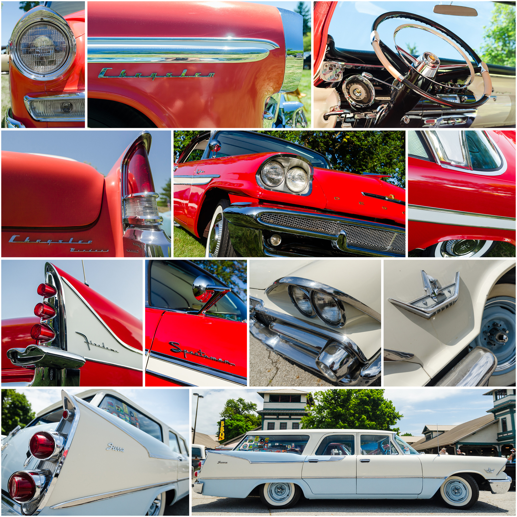
This past weekend was my Christmas of car shows weekend. Central Ohio hosted both the Goodguys PPG Nationals and the Arthritis Foundation Classic Car Show. I split my time between the two shows over three days and a crazy number of steps according to my smart watch. I my time seeing literally thousands of vintage and custom cars, three that stood out to me had one thing in common: they were Chrysler Corporation products designed under the direction of Virgil Exner during the 1950s. Do I have a “type” when it comes to ’50s Detroit steel? Apparently, I do.

The 1956 Chrysler Windsor Newport was an update of the revolutionary 1955 model that started Exner’s “forward look.” This Windsor trim level was not the top-of-the-line, but it was far from basic. The long, substantial lines somehow avoid looking heavy, and the two-tone white and salmon paint make for a great combo.

The 1958 DeSoto Firedome Sportsman was at the height of the late ’50s jet age excess and this example stopped me in my tracks. The two-tone white and red paint helped, but those fins! People often talk about the 1959 Cadillac fins, but the fins on the ’57 and ’58 DeSoto are every bit as impressive. And the jet-exhaust taillights! It amazes me that something like that could come out of the design department of a large corporation.

Finally, the 1959 Dodge Sierra station wagon combines those jet-age influences with the practicality of a wagon. When I see cars like this, it makes me resent current crossovers even more. If something like this Dodge Sierra existed today, I’d have no issue driving a “practical” vehicle.

Interested in a print of one of my MoPar photos, or others? Visit my store and place an order.

Top row, left to right: 1956 Chrysler Windsor Newport headlight, Windsor fender detail, Windsor dashboard. Second row, left to right: Windsor decklid and tailfin, 1958 DeSoto Firedome Sportsman front and flank, Firedome roof and rear fender. Third r…

Top row, left to right: 1956 Chrysler Windsor Newport headlight, Windsor fender detail, Windsor dashboard. Second row, left to right: Windsor decklid and tailfin, 1958 DeSoto Firedome Sportsman front and flank, Firedome roof and rear fender. Third row, left to right: Firedome tailfin, Firedome rearview mirror and badge, 1959 Dodge Sierra station wagon headlights, Sierra front fender badge. Bottom row, left to right: Sierra taillights and flank, Sierra profile.

Automotive Type, Part Eight

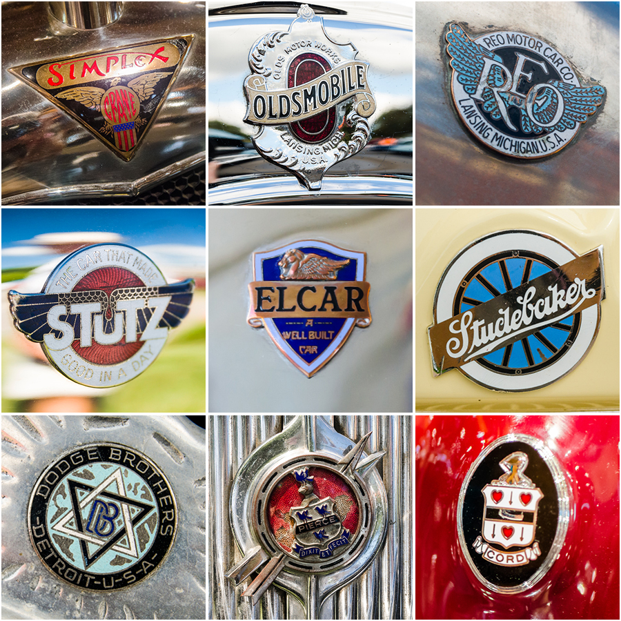
So the title is still Automotive Type, but my eighth post isn’t heavy on lettering. This is all about crests. Specifically, crests from pre World War II cars. In this period, they’re serving as brand logos prior to the simplification of the marks. As I pulled them from my archives, I was amazed by the range of styles from traditional “coat of arms” styles to more industrial representations of speed and strength. Bringing things back to type, check out the lettering on the Stutz and Studebaker badges! I love their character and they really hold up well over time.

If you’re interested in digging deeper into badge type design, check out writer and type expert Steven Coles’ excellent Tumblr page, Chromeography.

Interested in a print of one of my badge photos? Visit my store and place an order.

Top row, left to right: 1916 Simplex, 1917 Oldsmobile, 1922 REO Fire Truck. Middle row, left to right: 1925 Stutz, 1926 Elcar, 1927 Studebaker House Car. Bottom row, left to right: 1929 Dodge, 1936 Pierce Arrow, 1936 Cord.

Top row, left to right: 1916 Simplex, 1917 Oldsmobile, 1922 REO Fire Truck. Middle row, left to right: 1925 Stutz, 1926 Elcar, 1927 Studebaker House Car. Bottom row, left to right: 1929 Dodge, 1936 Pierce Arrow, 1936 Cord.

Elements: Space age Oldsmobiles

Nearly every american car company exploited the jet and space age in the 1950s and ’60s, but I’m not sure any other brand was as overt about it as Oldsmobile. When they introduced their new “high tech” overhead valve V8 in 1949, they branded it the “Oldsmobile Rocket”. From there, they ran with it. There were globe badges, jet flourishes, and names like Starfire and Jetfire. Here are some of my favorite “jet age” Olds details from that era.

Elements: 1963 Chrysler New Yorker

After all of his outrageous finned and jet-inspired designs of the late ’50s and early ’60s, one of Virgil Exner’s last designs for Chrysler was almost conventional. The 1963 Chryslers were very conservative compared to just a year before, but they still had some really amazing details. The “New Yorker” script is one of my favorite type badges. It would make such a great starting point for script typeface.

Showroom stock Camaro

Go to any vintage car show or cruise-in of any size, and you’re guaranteed to see multiple early Camaros tweaked to various degrees. But think about how often you see a first-gen Camaro that’s absolutely showroom stock. They’re damn near as rare as Barracudas and Javelins of the same vintage. This 1968 example is striking not just for it’s black and white on red color scheme, but for it’s time-capsule appearance. It’s a one-family car that was purchased new in the fall of 1967. Driven in high school by it’s current owner, then stored for 30 years. When the owner “dropped the bombshell” on her then fiancee that the car existed and would he help her restore it, his answer was an enthusiastic “I will”. The one stipulation was that when finished, it had to be as close as possible to how it was when her father purchased it. The only variance is the set of redline tires, which I think are a nice fit to the color scheme.

I'm not gonna lie. I’m not a big Camaro fan, but when I see an early example as it was when new, I can really appreciate how folks fall for these cars. They really are beautiful designs.