The two cars that I own have almost nothing in common with the cars that I'm such a huge fan of. Neither my 2009 BMW 128i nor my 2008 Mazda MX-5 Miata is a vintage, a classic, or a collector car. They don’t even draw much attention at the local, anything goes, Saturday Cars and Coffee. I consider them “cooler than the average Camry or Accord,” but they’re far from show cars.

My current wheels: a 2008 Mazda MX-5 Miata Grand Touring, and a 2009 BMW 128i with the sport package
My 2008 Miata is a fantastic car to drive, I’ve said many times that I’ll never part with it, but in recent months, I’ve thought about replacing it with a car more in line with the type that I love to photograph. This past February, I found a driver-condition 1955 DeSoto at a swap meet that was obtainable with the money I could get for my Miata. I seriously considered pursuing it, but decided stick with what I had. Just this past Saturday, I came across a disarmingly pretty 1967 Barracuda that had enough of a sentimental draw that I asked the owner if he’d consider selling it. I was dead serious.
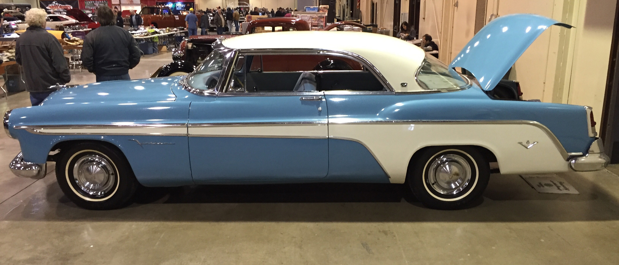
The 1955 DeSoto Firedome that could have replaced the Miata

The 1967 Barracuda "notchback" that I couldn't talk the owner into selling.
That evening, I read this Wired article. At the risk of twisting Jonathan Welsh’s words, I’m not going to summarize, so please take a moment to read it before reading the rest of my post. It was as if he wrote it specifically for me. Have I already owned the perfect toy for the past 6 years?
The only car that I’ve enjoyed as much as my Miata was the 1971 Dodge Challenger I owned in college. In the hypothetical situation that the Challenger ever came up for sale in at least the same condition as when I sold it, I’ve said that I’d give up the Miata for it. Who am I kidding? I couldn’t afford if it did show up on the Hemmings web site (confession: I’ve looked more than once). Even if I had the chance to drive it again, it would be familiar, but I'm sure I’d be shocked by its poor handling, numb steering, and the fact that it’s not even any faster than my Miata.

My old flame: a 1971 Dodge Challenger. Cooler than the other side of the pillow, but sloppy and slow by today's standards.
As for the DeSoto I mentioned, it had been sitting for 15 years and needed a water pump and radiator. What other related problems would reveal themselves? That 1967 Barracuda “doesn’t stop well—at all” according to the owner. I can hop in my Miata at any time, without worry that something will fail. It’s been bullet proof.
So how soon before my Miata becomes “special?” Mazda recently announced a new MX-5 RF that’s more of a sports coupe with a retractable roof than it is a roadster. The prototype at the unveiling was an automatic, which might be the first time Mazda has debuted a new MX-5 with an automatic before the manual version. I think this car is the future of the Miata, and I’m willing to bet that if it outsells the soft top model, within 3 years the soft top will be discontinued. With a manual soft top, 6-speed manual transmission, and analog limited-slip differential, my Miata model may soon be as unique as a car with vent windows and chrome bumpers, but much better to drive.
But enough rambling—I’m going for a drive.